


A safety manager's Monday morning inbox might hold a dozen incident notifications, three overdue actions, a contractor insurance certificate that is about to expire, and a board report due on Friday. All of it is useful information. The problem is knowing what to deal with first.
Health and safety teams are asked to do two jobs. The first is compliance: record what happened. The second is to get ahead of what might happen next. Most health and safety reporting setups were built for the first, and they struggle with the second.
What The Gap Looks Like
It’s the last week of the month, and the register shows dozens of open events, all marked “in progress”, all looking much the same. Nothing stands out, so nobody follows anything up.
Now put the same events on a chart, split them by stage and severity, and use colour to show how long each one has been open. One bar now stands out: a high-severity event that has been at the investigation stage for almost a month. Next to it, a closeout that should have been a quick check is still open. The data is the same as before, but now the manager knows who to call.
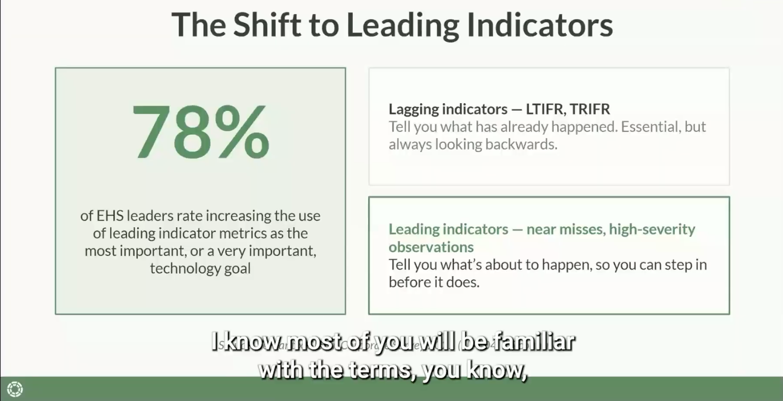
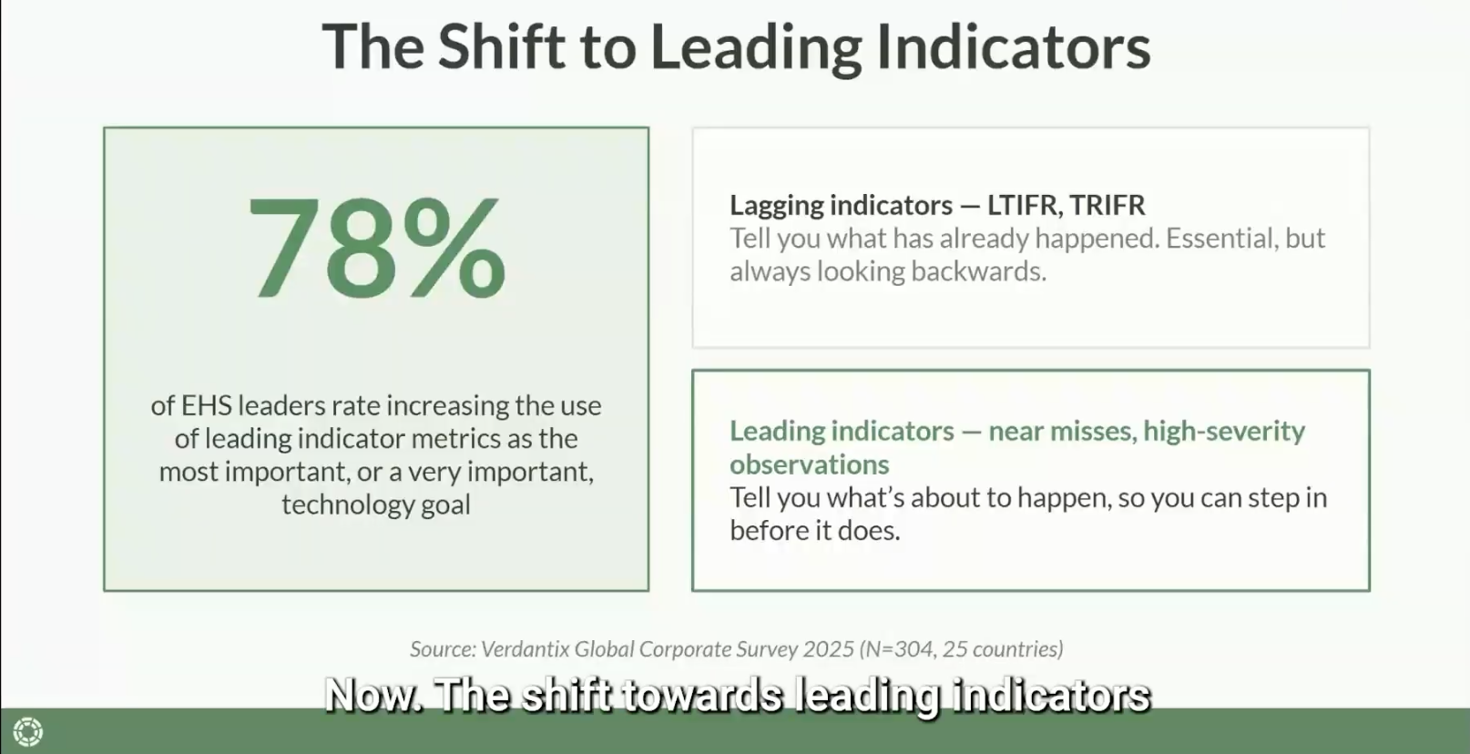
This is the gap between collecting data and being able to use it. According to
Verdantix Global Corporate Survey 2025, almost 78% of EHS leaders rate the use of leading indicator metrics as one of their most important technology goals.
The industry knows that lagging indicators, such as LTIFR and TRIFR, only show what has already happened. Leading indicators, such as near misses, high-severity observations and safety walks, help you act before the next incident.
But leading indicators only work if your data is structured well enough to show trends. A form full of open text fields can capture a lot of detail. On a dashboard, though, each of those forms is one page created on one date. To see a trend, the data has to be in fields you can filter.

Why This Matters Beyond Reporting
Leading indicators also affect how the whole organisation engages with risk.
Metlifecare, one of New Zealand's largest retirement village operators, shared on
LinkedIn that their combined safety walk and observation activity grew by almost 80% within six months and by more than 170% within nine months.
Growth like that takes real commitment from frontline staff and from leaders. Safety walks show leaders what is really happening day to day. Observations help the whole team take ownership of safety, and for many organisations, ownership is the harder part.
Different people also want different things from reporting. Ask H&S teams, and they usually want trends and patterns. Ask an executive team, and they usually want KPIs and compliance tracking. Are we protecting the business from liability? Are we meeting our legal obligations? Both views are valid, and good health and safety reporting serves both from one system.
Three Ways To Turn Raw Data Into Actionable Insight
Most teams already hold the data they need. The next step is to structure it so it can be filtered, segmented and acted on. Here are three places to start.
1. Segment For Context
A single number, like "21 open events this month", tells you very little. Split that number by stage, severity or location, and you can answer better questions. How many events are stuck in investigation? How many are high severity? Which sites are they at? Those are answers a manager can act on.
2. Design Your Forms For The Data You'll Need Later
Many teams skip this step. If the investigation outcome is a paragraph of free text, it is easy to read but hard to report on. If "cause of harm" and "how the harm occurred" are select fields, you can filter, chart and act on the same information. Before you build any reports, check your forms. Will they show you patterns over time, or only one event at a time?
3. Build Dashboards For Each Role
A regional manager doesn't need the same dashboard as your national H&S lead, and often shouldn’t see it. Role-based views change what a dashboard is for. An operational, day-to-day view shows a manager what is overdue today and who to follow up with. A strategic, trend-based view shows leaders whether the organisation is improving over months. When each person sees what is useful to them, they open the dashboard because it helps them do their job.
How Modern Safety Software Helps
Your team doesn't need to become data analysts. Good H&S software can now structure, filter and summarise your data for you. These tasks used to take hours.
With dashboards, you can filter and segment the data directly, so a manager can go from “here’s everything” to “here’s what’s stuck and overdue” in a few clicks, with no spreadsheet.
Scheduled reports then carry that data to the people who need it. Once a report is set up, the right data reaches the right people automatically, such as a list of contractor insurance certificates that expire in the next three months.
And AI-assisted summarisation helps when there is still too much to go through. Some platforms can now show the highest-priority items automatically, or answer a plain-language question about your data. This saves scrolling through fifty open entries to find the ones that matter.
The aim is to support your team's judgement. When it is quicker to understand the data, your team has more time to act on it.
Final Words
The goal is to get more value from the data your team already collects. The people closest to the risk and the people accountable for it should see the same picture, shown in a way that is useful to each of them.
Worker engagement is also a legal duty. In New Zealand, the Health and Safety at Work Act 2015 requires a PCBU to engage with workers who are, or are likely to be, directly affected by a health and safety matter, so far as is reasonably practicable. In Australia, the WHS Act 2011 requires a PCBU to consult those workers on the same basis.
In Great Britain, the Health and Safety at Work etc. Act 1974 requires employers to consult trade union safety representatives. The Health and Safety (Consultation with Employees) Regulations 1996 extend this duty to employees who are not represented in that way.
Leading indicators built from near misses, observations and safety walks are one of the clearest ways to show this engagement in practice.
Get the structure right, and the data your team is already generating becomes exactly what your board and your frontline actually need to see.
Key Takeaways
-
Leading indicators only work if your data can be filtered and charted. Free text describes one event; structured fields let you see patterns over time.
-
Your H&S team and your board often want different things from health and safety reporting: trends versus KPIs. A well-structured dashboard can serve both from one system.
-
Splitting data by severity, stage or location turns a single number into something you can act on. Role-based views make sure each person sees what matters to them.
Ready to see what your data could tell you?
.png?width=352&name=From%20Arrival%20to%20Departure%20(1).png)
.png?width=352&name=_Paper%20Safe%20Why%20Compliance%20Isn%E2%80%99t%20Enough%20to%20Keep%20You%20Out%20of%20Court%20(3).png)
